Mobile Optimization for Yoga Studios: Why 70% of Your Bookings Come from Phones
Mobile Optimization for Yoga Studios: Why 70% of Your Bookings Come from Phones
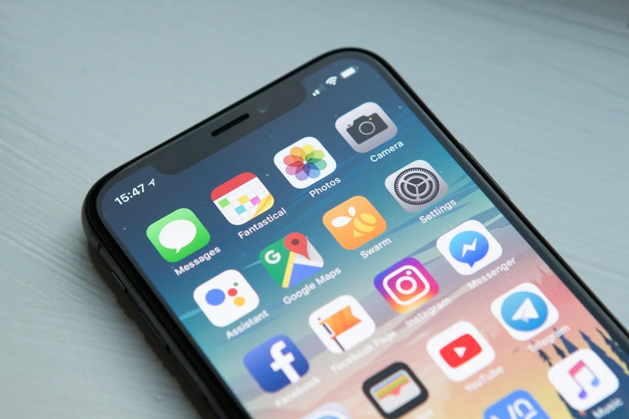
The majority of people who find your yoga studio online do so on a phone. Not because they are young or tech-savvy, because that is how nearly everyone searches for local services in 2026. The person searching "yoga near me" at 7:30am before work is on their phone. The person who remembered to book a class at 10pm is on their phone. The person who saw your Instagram post and tapped through to your website is on their phone.
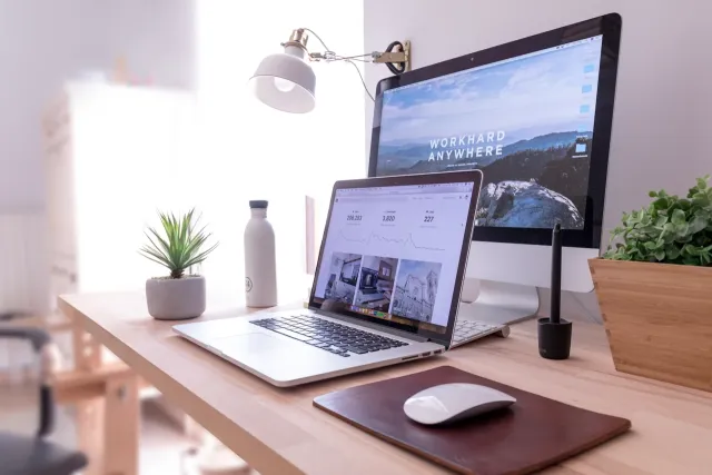
If your website was designed on a desktop and adjusted to fit a mobile screen, which describes the majority of wellness websites built on Squarespace, Wix, or similar platforms, you are presenting every one of those visitors with a compromised experience. And a compromised experience leaks conversions silently, leaving no obvious trace of the clients you lost.
What Mobile-First Design Actually Means
"Mobile-first" is a phrase that gets used loosely, but its meaning is precise: the design process begins with the mobile experience as the primary canvas, and the desktop version is built as an expansion of that, not a compression of it.
In practice, this means making every spacing, sizing, and layout decision based on what works on a 390-pixel-wide screen before considering how it might look on a 1440-pixel-wide desktop. The mobile experience is not a simplified version of the desktop experience. It is the experience, for most of your visitors.
The reason this matters beyond aesthetics: Google has used mobile-first indexing since 2021, meaning the mobile version of your website is the version Google evaluates for search ranking. A website that performs beautifully on desktop but poorly on mobile will rank as if it performs poorly, because, for most of its visitors, it does.
The Numbers Behind Mobile Traffic for Wellness
Across the wellness industry, mobile devices account for between 65% and 75% of web traffic, depending on the studio and its location. The figure is typically higher for urban studios, where commuters are searching during transit, and lower for rural practices, where desktop usage remains more common.
But raw traffic share is only half the story. The more significant figure is mobile conversion rate, the proportion of mobile visitors who actually book. For a desktop-optimised site viewed on mobile, conversion rates are typically 50% to 60% lower than on desktop. The visitor intent is the same; the friction is higher; the outcome is dramatically different.
A studio with 1,000 monthly website visitors, 70% on mobile, and a 2% mobile conversion rate is booking 14 clients from mobile traffic. The same traffic with a 4% mobile conversion rate (achievable with proper optimisation) would book 28 clients. Without changing advertising spend, without improving the quality of the yoga, without any additional marketing effort.
Touch Targets: The Problem Nobody Talks About
The minimum recommended touch target size (the area that needs to be tappable on a touchscreen) is 44 by 44 pixels, per Apple's Human Interface Guidelines and Google's Material Design specifications. This is approximately the size of a fingertip.
Most yoga studio websites violate this constantly. Navigation links in small type, spaced closely together, require surgical precision to tap without hitting the wrong item. Form field labels that are technically clickable but practically too small to reliably select. "Book Now" buttons that look large on desktop but shrink to 30 pixels tall on mobile.
The consequence is friction. The visitor who misses the button and accidentally navigates to the wrong page, or who cannot reliably select a form field, is a visitor who is more likely to give up. On desktop, imprecision is forgiving (the cursor is a pixel. On mobile, imprecision is the default) the finger is large and inexact.
Every interactive element on a mobile screen must be large enough to tap confidently. This means buttons with a minimum height of 44 pixels, form fields with adequate padding, navigation items with generous spacing.
Typography: What Works on Desktop Can Be Unreadable on Mobile
The body copy font size that reads comfortably on a desktop (typically 15 to 16 pixels) becomes small and difficult to read on a mobile screen held at arm's length. The recommended minimum for body text on mobile is 16 pixels; 18 is better for a wellness site, where a significant portion of your audience may be in their 40s, 50s, or older.
More critical than the body text is the contrast between text and background. Wellness brands frequently choose low-contrast colour palettes (cream text on warm white, light grey on ivory) that look beautiful on high-brightness desktop monitors and become nearly illegible on phones in normal lighting conditions. The WCAG standard requires a contrast ratio of at least 4.5:1 for body text. Many wellness sites fail this at both desktop and mobile sizes.
Headlines present the opposite problem: they frequently shrink too aggressively on mobile, losing their visual impact. A 72-pixel headline that anchors a desktop hero becomes a 28-pixel headline that looks uncertain on a phone. The size reduction needs to be handled carefully, preserving the visual hierarchy at every screen size.
The Booking Flow on Mobile: Where Studios Lose the Most Clients
The booking process is the most consequential part of your mobile experience, and typically the most neglected. A visitor who has navigated to your class schedule on a phone and wants to book a class is at the highest point of conversion intent. Whatever happens next will either complete or abort that booking.
The booking flows that fail on mobile share predictable characteristics:
They require too many steps. Each additional screen is an opportunity for the visitor to give up or get interrupted. The mobile booking flow should aim for three steps at most: select a class, enter basic details, confirm.
They use desktop-formatted form elements. Date pickers designed for mouse interaction are notoriously difficult to use on mobile. Dropdowns with small touch targets require multiple attempts. Forms with fields spaced for desktop use require horizontal scrolling.
They load slowly. A booking widget that loads in one second on desktop may take three to five seconds on mobile over a typical 4G connection. The visitor who waited three seconds to reach the booking flow and then waits another four seconds for the booking widget to load is a visitor you are likely to lose.
Test your booking flow end-to-end on your actual phone, on a 4G connection, in the middle of a typical day. Not on WiFi. Not on a desktop simulator. On the actual device your actual visitors are using in actual conditions.
Speed: The Non-Negotiable
Page speed on mobile is categorically more important than page speed on desktop, because mobile connections are slower, mobile hardware is less powerful, and mobile users are more likely to be in contexts where a slow page causes abandonment.
Google's research shows that 53% of mobile users abandon a site that takes more than three seconds to load. For a site that takes five seconds, that figure climbs above 70%. Every second of load time beyond the first costs you a measurable percentage of your potential clients.
The most common mobile speed killers for yoga studio websites:
Full-resolution images served to mobile devices. An image that is 3,000 pixels wide looks identical to a 750-pixel version on a phone, but takes four times as long to download. Images should be sized appropriately for the device using responsive image techniques, and should be served in WebP format, which reduces file sizes by 25–35% compared to JPEG at equivalent quality.
Render-blocking scripts. Page builder platforms load scripts that must fully execute before the page becomes visible. On a desktop, this may add half a second. On mobile over a slow connection, it can add three to five seconds.
Fonts loading synchronously. Google Fonts and similar web font services, loaded without optimisation, can delay the appearance of readable text significantly. Proper font loading (using font-display: swap and preconnect hints) can reduce this delay to near zero.
Test your mobile speed at PageSpeed Insights. The mobile score is the one that matters. A score below 50 means visitors are experiencing meaningful load delays. Above 90 means you are in a minority of wellness sites that have actually solved this.
The Simple Test
Open your studio website on your phone. Without pinching, zooming, or horizontal scrolling, can you:
- Understand what the studio offers within five seconds?
- Find the class schedule?
- Tap the booking button without hitting something else?
- Complete a booking without leaving the flow?
If the answer to any of these is no, you have a mobile problem. It is costing you clients silently, every day.
At GladeForm, mobile performance is not an afterthought, it is a design requirement. Every site we build is tested across device types, screen sizes, and connection speeds before it goes live. If you want to understand what a mobile-first yoga studio site looks like end-to-end, our yoga studio web design page covers the full picture. If your current site is leaking mobile conversions, an audit will show you exactly where and why.

Founder & Lead Engineer, GladeForm
Palash builds high-converting digital environments exclusively for wellness practitioners. Before GladeForm, he spent years engineering digital products across industries — and kept returning to the same problem: the gap between how talented a practitioner was and how they appeared online. Learn more →